Linda Nishio Messages to the Public: Competitor
About the Exhibition
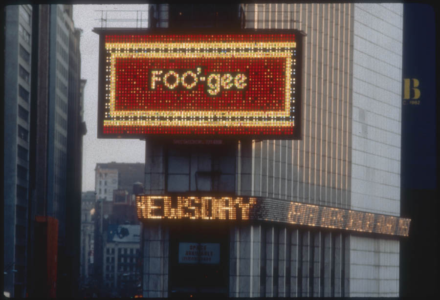
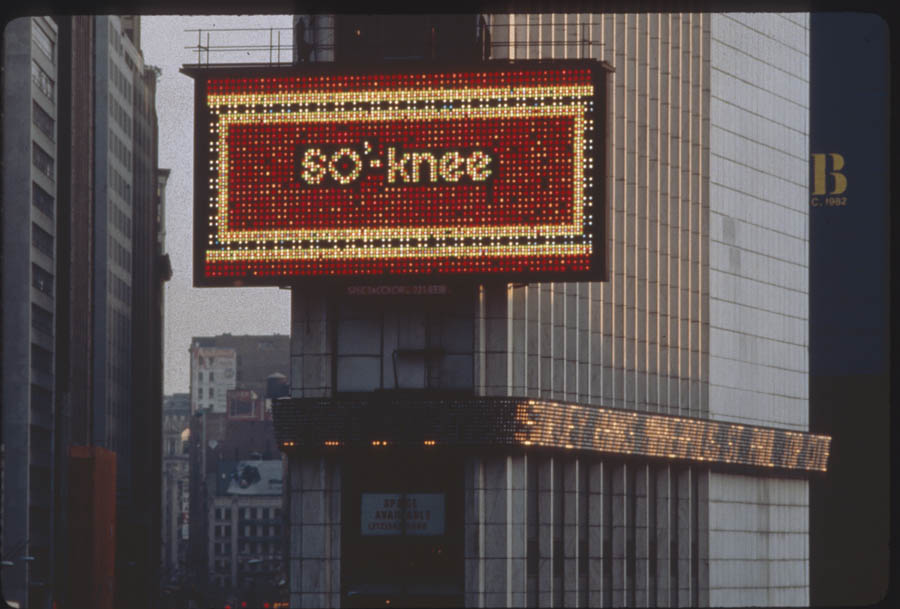
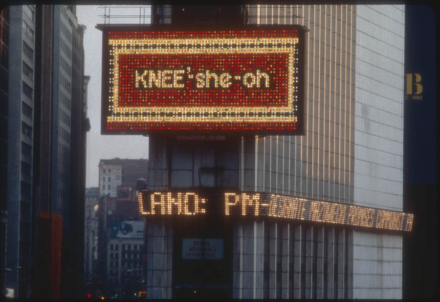
Linda Nishio’s 30-second computer animation opens with white, 15-foot-high letters that spell out “meet-sue-BEE’-she.” The message, on a red ground and framed by red, white, and blue borders, quickly dissolves. It is followed at three-second intervals by five additional, phonetically altered spellings of familiar Japanese corporate names, including well-known manufacturers of video games, film, electronics, and automobiles. The final four frames of Nishio’s message offer a clue to the phonetic puzzle with both phonetic (KNEE’-sheo-oh) and correct spellings of the artist’s name.
In Competitor, Nishio (b. 1952) seeks to equalize the power balance between what she describes as “the alienated individual and the powerful corporation.” Nishio’s strategy is to undermine the corporate persona in order to attain a position of power. She begins by satirizing the almost universal conceit of adopting-the-family-name-as-business-name and juxtaposes her name with those of famous, but anonymous, Japanese corporate names like Fuji, Toyota, Mitsubishi, Nissan, Sony, and Nintendo.
Nishio states, “The individual has always been at a disadvantage when competing with corporations because of their lack of access to the media.” She continues her campaign of one-upmanship by depriving her “competitors” of brand-name recognition. Instead of correctly spelling out each corporate name, Nishio transforms the familiar emblems into skewed, intentionally silly, phonetic spellings.. Fuji becomes “FOO-gee,” Sony becomes “SO’-knee,” Nissan becomes “KNEE’sahn,” Nintendo becomes ‘nen-ten-DOUGH,” Toyota becomes “tow-YO’taah,” and Mitsubishi becomes “meet-sue-BEE’-she.”
Even though Nishio’s phonetics always maintain the integrity of the actual Japanese pronunciations, she is able to suggest a sense of their foreign origins by offering what appears, at first reading, nonsensical, alien-sounding names. And although she subjects her name to this same phonetic regimen, ultimately Nishio is the winner—hers is the only name that is offered with a non-phonetic, correct spelling. In this way Nishio both tips the balance of power in her favor, and at the same time makes us aware of just how assimilated into our language the names of these foreign manufacturers have become in recent years.
Photo Gallery
About the Series
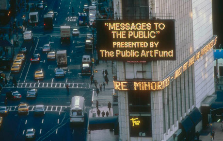
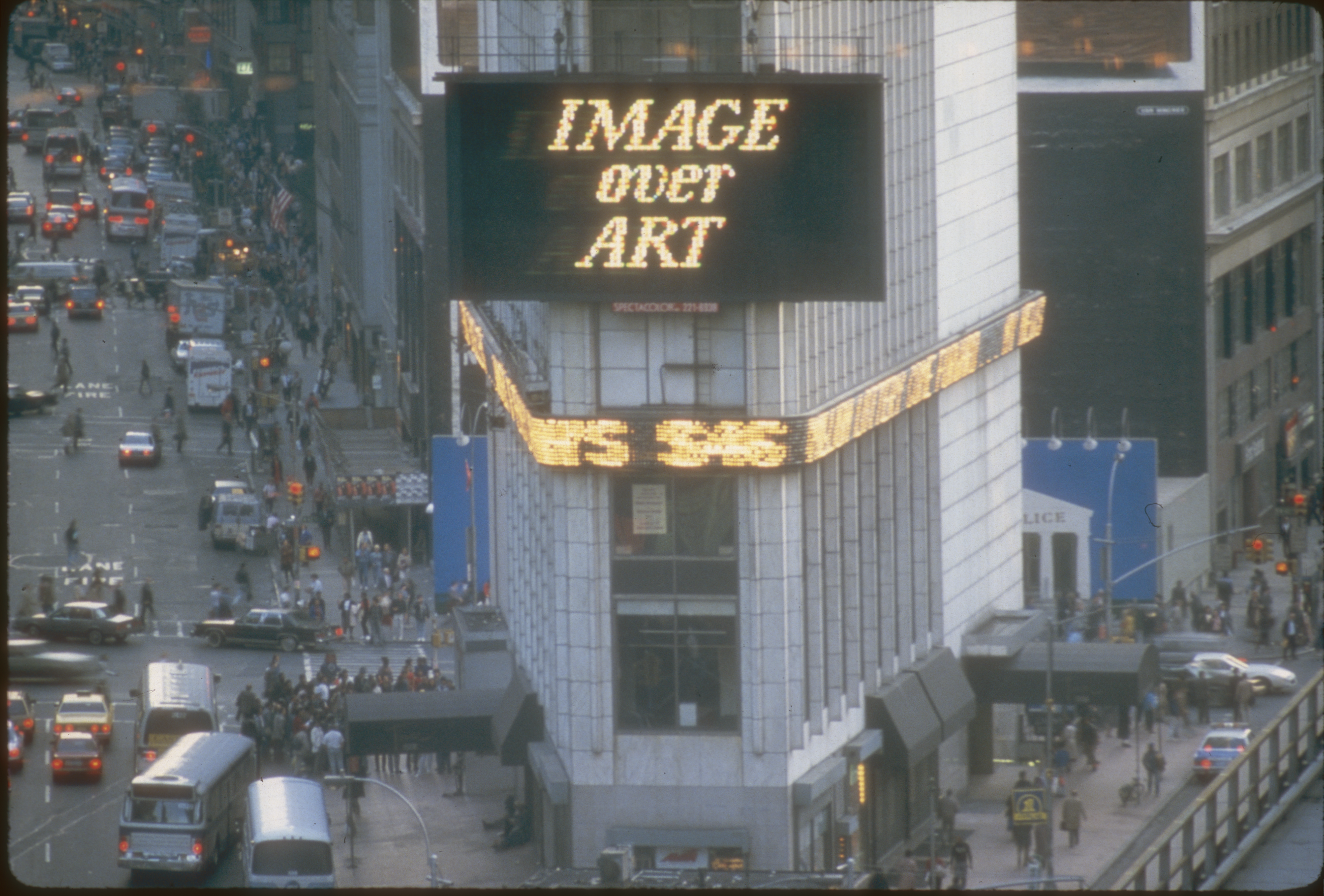
Messages to the Public formed a key part of the Public Art Fund’s long-term commitment to media-based artworks. Running from 1982 to 1990, the show featured a series of artists’ projects created specifically for the Spectacolor board at Times Square.
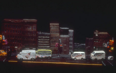
As Russell Miller from Ohio newspaper The Toledo Blade explained in his article on February 19, 1984, “every month, a different artist presents a 30-second animation on the Spectacolor light board—an 800-square-foot array of 8,000 red, white, blue, and green 60-watt bulbs that dominates the Times Square vista. The spot is repeated more than 50 times a day for two weeks, wedged into a 20-minute loop of computer-animated commercials.
“Jane Dickson, a painter, was working for Spectacolor, Inc. as an ad designer and computer programmer when, three and a half years ago, she first thought to use the light board to display noncommercial art.
“‘I picked that title,’ she said of Messages to the Public, ‘because I thought the propaganda potential from this project was terrific.’ The board, she noted, was regularly used for ‘commercial propaganda.’
“Dickson sought help from the Public Art Fund, an organization based here and dedicated to taking art out of the galleries and placing it in the city’s streets and parks.”
Project Director of the Public Art Fund Jessica Cusick explained, “We’re trying to do art that’s timely, has a message, is visually potent and is trying to deal with the fine line dividing fine art and commercial art.”
Related Exhibitions