Rebecca Howland Messages to the Public: Electric City
About the Exhibition
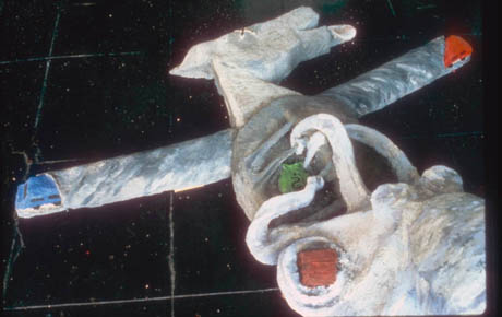
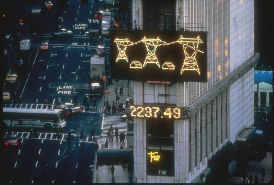
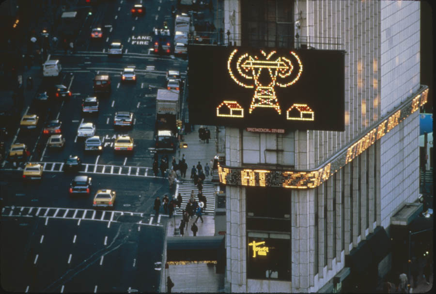
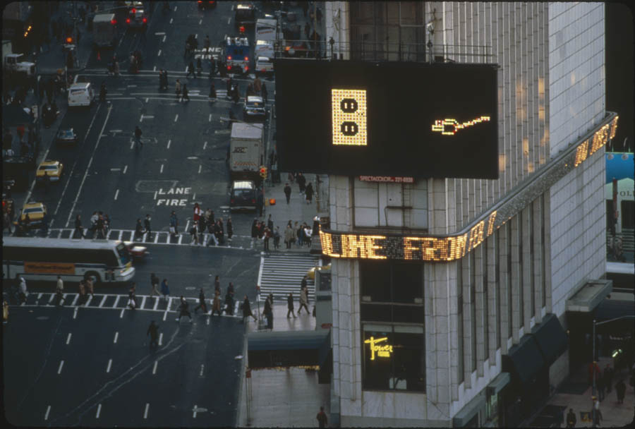
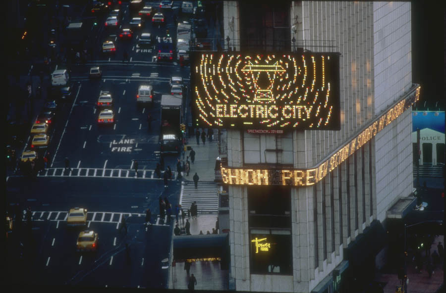
In her message titled Electric City, Rebecca Howland (b. Niagara Falls, NY) makes the invisible visible by depicting the flow of electricity. The broadcast begins with an ordinary electrical plug in an outlet. The plug then somersaults on the screen several times before transforming itself into three transmission towers that overpower a landscape with houses in the foreground. All objects disappear except the middle tower, which is shown to have spiraling electrons exploding off the wires. The “spirals” fill the lightboard and the words “Electric City” pulsate as they are superimposed on the original image.
Photo Gallery
About the Series
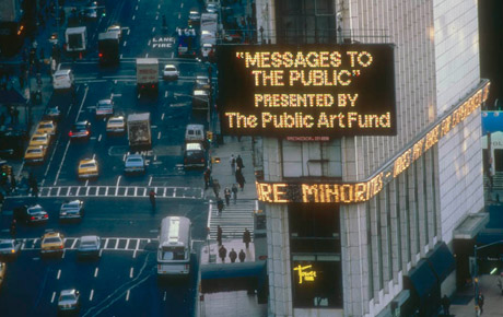
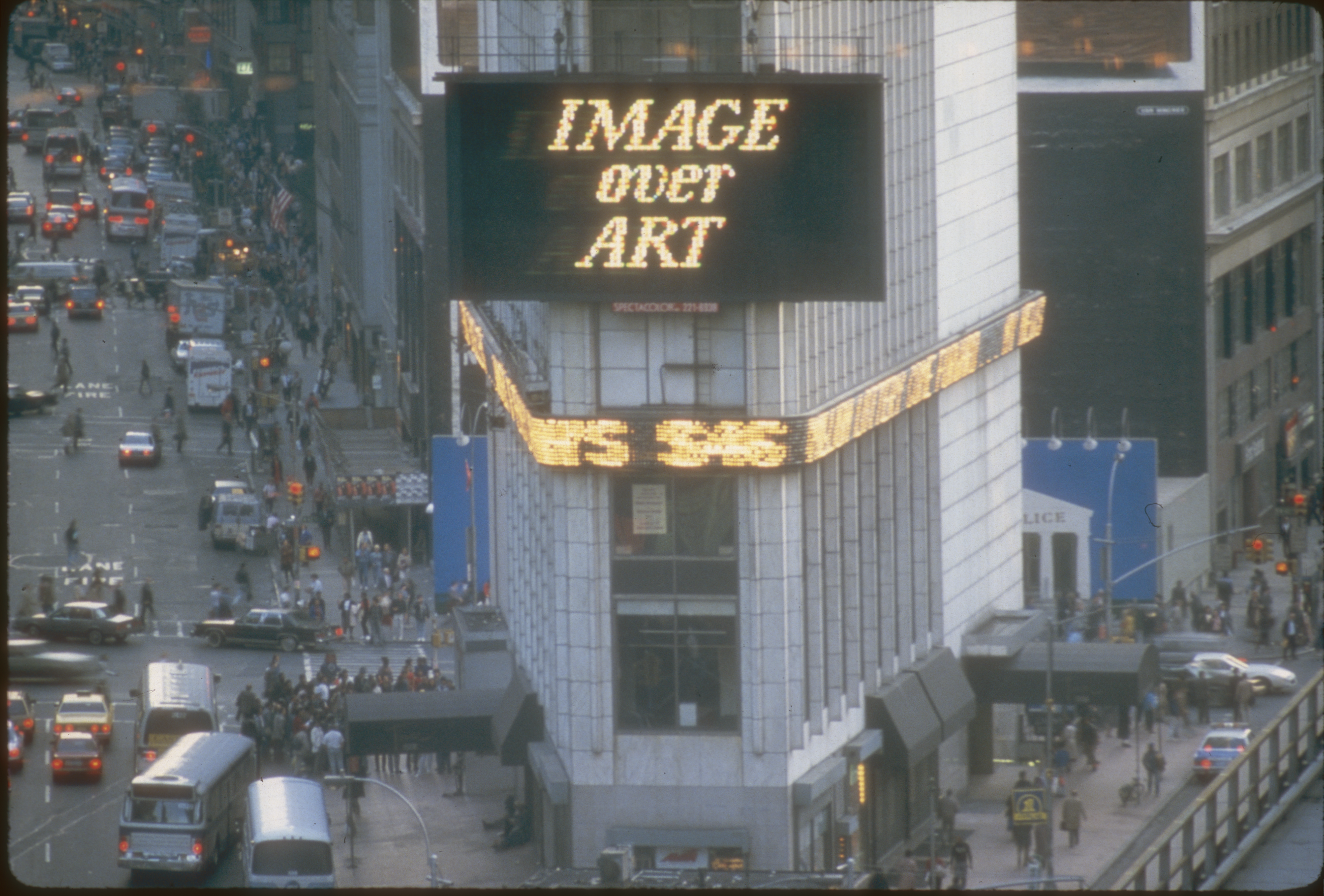
Messages to the Public formed a key part of the Public Art Fund’s long-term commitment to media-based artworks. Running from 1982 to 1990, the show featured a series of artists’ projects created specifically for the Spectacolor board at Times Square.
As Russell Miller from Ohio newspaper The Toledo Blade explained in his article on February 19, 1984, “every month, a different artist presents a 30-second animation on the Spectacolor light board—an 800-square-foot array of 8,000 red, white, blue, and green 60-watt bulbs that dominates the Times Square vista. The spot is repeated more than 50 times a day for two weeks, wedged into a 20-minute loop of computer-animated commercials.
“Jane Dickson, a painter, was working for Spectacolor, Inc. as an ad designer and computer programmer when, three and a half years ago, she first thought to use the light board to display noncommercial art.
“‘I picked that title,’ she said of Messages to the Public, ‘because I thought the propaganda potential from this project was terrific.’ The board, she noted, was regularly used for ‘commercial propaganda.’
“Dickson sought help from the Public Art Fund, an organization based here and dedicated to taking art out of the galleries and placing it in the city’s streets and parks.”
Project Director of the Public Art Fund Jessica Cusick explained, “We’re trying to do art that’s timely, has a message, is visually potent and is trying to deal with the fine line dividing fine art and commercial art.”
Related Exhibitions